

Two thumbs up… way up…
Advertisement
Read this article for free:
or
Already have an account? Log in here »
To continue reading, please subscribe:

Digital Subscription
One year of digital access for only $205*
- Enjoy unlimited reading on winnipegfreepress.com
- Read the E-Edition, our digital replica newspaper
- Access News Break, our award-winning app
- Play interactive puzzles
*First annual payment billed as $205.00 + GST for one year. This annual subscription will automatically renew at $233.00 + GST every 52 weeks (10% off the regular annual price of $259.35). Offer available to new and qualified returning subscribers only. Cancel any time.
To continue reading, please subscribe:
Add Free Press access to your Brandon Sun subscription for only an additional
$1 for the first 4 weeks*
- Enjoy unlimited reading on winnipegfreepress.com
- Read the E-Edition, our digital replica newspaper
- Access News Break, our award-winning app
- Play interactive puzzles
*Your next Brandon Sun subscription payment will increase by $1.00 and you will be charged $17.95 plus GST for four weeks. After four weeks, your payment will increase to $24.95 plus GST every four weeks.
Read unlimited articles for free today:
or
Already have an account? Log in here »
Hey there, time traveller!
This article was published 25/07/2011 (5464 days ago), so information in it may no longer be current.
Nobody asked me, but I’m a little surprised by some of the negative commentary over the weekend about the Winnipeg Jets’ new logo.
Scrolling the fan boards and chat rooms and it’s obvious there are a good many of you upset with the new air-force based design. That’s fair — everyone is entitled, everyone is an art critic.
Look, I’ve been in homes where the focal point of a living room is a giant rug featuring a wolf hanging from the wall. Doesn’t work for me at all, but to each his own. Some folks like abstract art that looks — from this vantage point — like somebody knocked over a paint-by-numbers set on a canvas. Others are into landscapes or portraits.
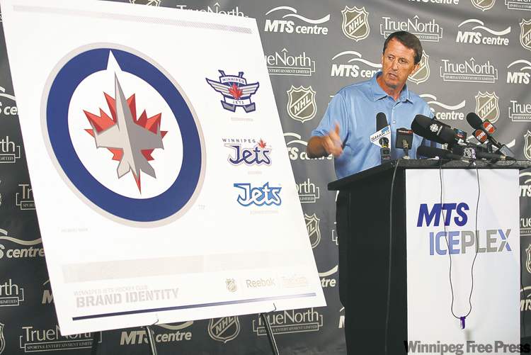
The point here is that art — in this case, a sports logo — is of personal taste and no matter what True North came up with there were going to be critics.
As a personal aside, I love it. And as the grandson of a man who fought in World War I — and my great, great uncle Sir Victor Tait was vice marshall of the RAF in WWII and played hockey for Great Britain at the 1928 Winter Oympics — I am absolutely thrilled with the tribute to our air force.
Now, just FYI, here’s some other fuel to this debate. I Googled ‘Worst Sports logos’ and came across this article from AskMen.com.
For those of you not interested in scrolling through it, their worst featured:
10. Washington Capitals
9. Buffalo Bills
8. Dallas Mavericks
7. Tennessee Titans
6. Anaheim Ducks
5. Toronto Raptors
4. Tampa Rays
3. Memphis Grizzlies
2. Portland Trailblazers
1. Carolina Hurricanes
The AskMen.com judges said this of the Hurricanes’ logo:
“The Canes logo has a startling resemblance to water spinning in a toilet bowl — and we hope that’s supposed to be a puck in the center.”
And, for what it’s worth, TotalProSports.com also came up with their own list of the worst sports logos of all time and voted the Victoria Salmon Kings as worst ever.
Another read on the Jets logo.

* * *
CORSI RATINGS
We’ve mentioned before in the paper about the Corsi rating used by some NHL types to study a player’s value to a team based on more than just plus-minus, but on puck possession and shots, etc.
The latest adjusted Corsi Ratings by The Puck Stops Here has Jets’ D-man Dustin Byfuglien ranked first overall. To read more, click here.
— Ed Tait