

Whether warm or cold, purple is hot
Advertisement
Read this article for free:
or
Already have an account? Log in here »
To continue reading, please subscribe:
Monthly Digital Subscription
$1 per week for 24 weeks*
- Enjoy unlimited reading on winnipegfreepress.com
- Read the E-Edition, our digital replica newspaper
- Access News Break, our award-winning app
- Play interactive puzzles
*Billed as $4.00 plus GST every four weeks. After 24 weeks, price increases to the regular rate of $19.00 plus GST every four weeks. Offer available to new and qualified returning subscribers only. Cancel any time.
Monthly Digital Subscription
$4.75/week*
- Enjoy unlimited reading on winnipegfreepress.com
- Read the E-Edition, our digital replica newspaper
- Access News Break, our award-winning app
- Play interactive puzzles
*Billed as $19 plus GST every four weeks. Cancel any time.
To continue reading, please subscribe:
Add Winnipeg Free Press access to your Brandon Sun subscription for only
$1 for the first 4 weeks*
*$1 will be added to your next bill. After your 4 weeks access is complete your rate will increase by $0.00 a X percent off the regular rate.
Read unlimited articles for free today:
or
Already have an account? Log in here »
Hey there, time traveller!
This article was published 22/04/2017 (3058 days ago), so information in it may no longer be current.
The colour purple has evolved well beyond links to Barney the Dinosaur to become a favourite colour for politics, hair and flowers. It’s little understood as a hue because royal purple is not the only shade offered. In fact, purple has two faces. It runs warm and cold. It is the high-frequency child of two primary colours.
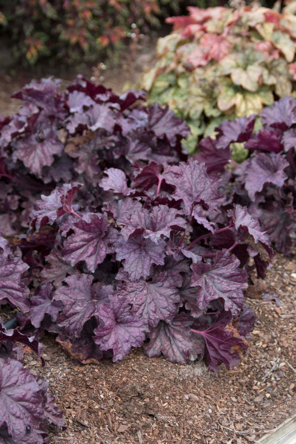
Purple is the result of combining hot fire red and cool ocean blue. When the two primaries merge to form purple, there is a range of hues divided by the emphasis on one or the other primary colour. The red-dominant purples will be warm and vibrant, seen as more energetic to the human eye. The blue-purples are subdued, cooler and seen as peaceful and contemplative.
Nowhere else but in the garden does the full range of hot and cold purples appears in full sunlight. Merely looking for a purple flower at the garden can vastly oversimplify a complex set of hues. If you become aware of the two temperatures, it will provide you a far more powerful grasp of colour in garden design. It will also help you train your eye to recognize these subtle differences.
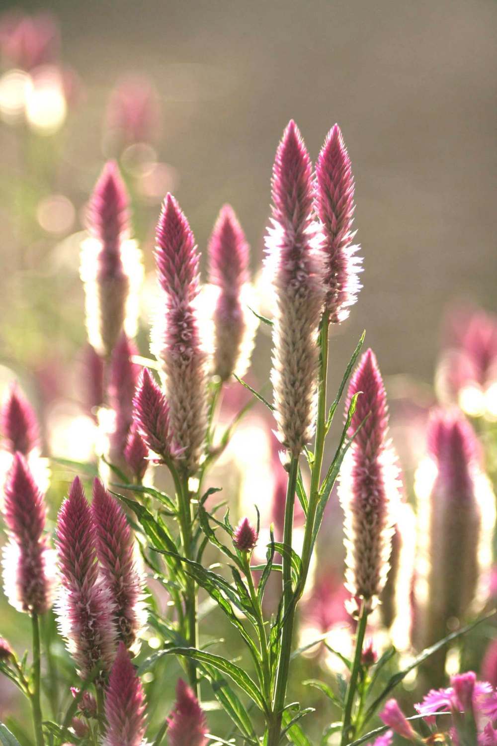
While lavenders and magenta are common in nature, true purples are not. Nature uses purple sparingly, almost as an afterthought. If used carefully in precise locations relative to other colours, you can create dynamic results.
Above all, you want to strive for harmony in your flower colour palettes. Those combinations that are not harmonious will affect you in two ways. First, the colours may be so understated as to be dull or even boring. On the other hand, colours without consideration of each other will appear chaotic. Essentially, these results will either put you to sleep or drive you nuts.
The colour wheel is vital to understanding the harmonious use of purple in the garden. Directly across the wheel from purples is lime green and yellow. These are complementary colours that, when paired with the purples, create a dynamic contrast that brings out the best qualities of both hues.
Red-purple is the complement of yellow green or lime green. Blue purple’s complement is canary yellow. If you were to put purple flowers in a field of green foliage, the purples would be gobbled up by the greens, a primary colour. But when you use these purples with their complements to create three hues in a palette of green, yellow and purple, there is a harmonious combination.
You can also explore analogous colours. These are colours that match. You’ll find analogous colours contiguous on the colour wheel. For example, red, orange and yellow are analogous.
When using purples, your analogous hues will be different for each one. The analogous range for red-purple would be red and orange. This gives you a hot-coloured palette for flowers that work with that type of purple.
When using a blue-purple, the analogs would be blue and turquoise or green. This is the start of a cool-coloured palette bouncing off that blue-based purple.
With a new knowledge of the two purples and how they relate to other colours, you will have the basis for a great garden this year. It tells you how to choose plants by colour, and it dictates you choose those that bloom at the same time to achieve the desired results. A plant that blooms purple in May will not benefit from a complementary yellow daisy that flowers in August. Getting bloom time, colour and size just right is the formula for picture perfect colour garden design.
So if you love purple, use it with aplomb and flair. Paint it into the garden with full knowledge of its two faces. Then celebrate with flowers of this same hue reserved for pharaohs, priests and patriarchs.
— Tribune News Service