MJHL’s newest club unveils ‘mean’ logo
Advertisement
Read this article for free:
or
Already have an account? Log in here »
To continue reading, please subscribe:
Monthly Digital Subscription
$0 for the first 4 weeks*
- Enjoy unlimited reading on winnipegfreepress.com
- Read the E-Edition, our digital replica newspaper
- Access News Break, our award-winning app
- Play interactive puzzles
*No charge for 4 weeks then price increases to the regular rate of $19.00 plus GST every four weeks. Offer available to new and qualified returning subscribers only. Cancel any time.
Monthly Digital Subscription
$4.75/week*
- Enjoy unlimited reading on winnipegfreepress.com
- Read the E-Edition, our digital replica newspaper
- Access News Break, our award-winning app
- Play interactive puzzles
*Billed as $19 plus GST every four weeks. Cancel any time.
To continue reading, please subscribe:
Add Free Press access to your Brandon Sun subscription for only an additional
$1 for the first 4 weeks*
*Your next subscription payment will increase by $1.00 and you will be charged $16.99 plus GST for four weeks. After four weeks, your payment will increase to $23.99 plus GST every four weeks.
Read unlimited articles for free today:
or
Already have an account? Log in here »
Hey there, time traveller!
This article was published 01/04/2022 (1324 days ago), so information in it may no longer be current.
THE Niverville Nighthawks had already chosen a nickname, begun assembling a roster and hired a coaching staff.
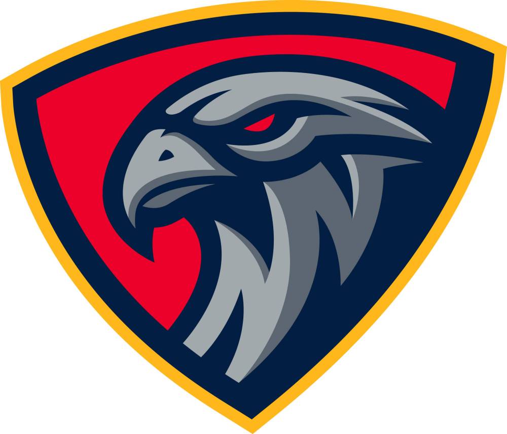
On Thursday, the Manitoba Junior Hockey League expansion franchise unveiled its logos and colour scheme.
With board member Ray Dowse playing a lead role in the search, the not-for-profit club hired Brooks Freeman Design of Virden to design its on-ice look.

Freeman had a track record of working with hockey logos and uniforms, designing new looks for the WHL’s Prince Albert Raiders, Brandon Wheat Kings and the MJHL’s Virden Oil Capitals and the recently completed rebrand of the Neepawa Titans.
“The team knew they wanted to do something very unique to not just the MJHL, but hockey in general,” said Freeman in a release.
“We tried a couple of versions with different shades of purples, greys, blues, and reds before settling on the navy, red, grey, and yellow. This bold colour scheme is sure to stand out, and I think it really helps the logos and jerseys become more appealing.”
Head coach and general manager Kelvin Cech, whose club will open play with the 2022-23 season, is enthusiastic about the design.
“I’m a bit biased, but I think it’s the best logo in the whole world. It represents us and our town very well,” said Cech. “All of a sudden, this feels very real. We have a name and a distinct look, as that hawk is very menacing and mean, very proud and bold. We’re stoked.”

mike.sawatzky@freepress.mb.ca
Twitter: @sawa14
History
Updated on Friday, April 1, 2022 9:25 AM CDT: Adds headline


