Looking like an eggplant in a Vikings jersey
Advertisement
Read this article for free:
or
Already have an account? Log in here »
To continue reading, please subscribe:

Digital Subscription
One year of digital access for only $205*
- Enjoy unlimited reading on winnipegfreepress.com
- Read the E-Edition, our digital replica newspaper
- Access News Break, our award-winning app
- Play interactive puzzles
*First annual payment billed as $205.00 + GST for one year. This annual subscription will automatically renew at $233.00 + GST every 52 weeks (10% off the regular annual price of $259.35). Offer available to new and qualified returning subscribers only. Cancel any time.
To continue reading, please subscribe:
Add Free Press access to your Brandon Sun subscription for only an additional
$1 for the first 4 weeks*
- Enjoy unlimited reading on winnipegfreepress.com
- Read the E-Edition, our digital replica newspaper
- Access News Break, our award-winning app
- Play interactive puzzles
*Your next Brandon Sun subscription payment will increase by $1.00 and you will be charged $17.95 plus GST for four weeks. After four weeks, your payment will increase to $24.95 plus GST every four weeks.
Read unlimited articles for free today:
or
Already have an account? Log in here »
Hey there, time traveller!
This article was published 24/03/2018 (3037 days ago), so information in it may no longer be current.
The sides of my driveway are lined with snowdrifts taller than Grade 3 students and there are icicles dangling from my gutters that are the same size and shape as piano legs.
Which can mean only one thing — it’s springtime in Winnipeg.
And yet, something seems amiss. Even though the March equinox rolled into town on Tuesday to herald the arrival of astronomical spring, it is hard to accept that nature’s annual season of rebirth and renewal is truly here.
The problem is that the one surefire sign of spring is missing in the sense that, instead of being mathematically eliminated from the Stanley Cup Playoffs and heading to the golf course, the Winnipeg Jets are poised to make a deep run in the hunt for Lord Stanley’s silver mug.
OK, we love the Jets more than life itself, but the thing is Winnipeggers need something to hold onto, a spiritual anchor, something that slaps them upside their unfashionable heads and shrieks:
“Hey, Winnipeg, spring is here, so dust off the barbecue and put on your Bermuda shorts.”
In case I am being far too subtle, what I am trying to say, Winnipeg, is that once again it’s time for the one thing that makes these chilly first days of spring bearable — Mr. Doug’s Annual Spring Fashion Report.
This is the much-loved seasonal feature that Mr. Doug publishes every year, unless, of course, he forgets — which he sort of did this week due to the fact that, as already mentioned, Mr. Doug has had a hard time tearing himself away from the couch, where he stares up at his big-screen TV to watch the Jets thrilling quest for NHL supremacy.
But today’s column is not about hockey; no, today’s column is about fashion — namely, which bizarre colour scheme will your cutting-edge wardrobe be required to showcase this season?
Well, prepare to burst spontaneously into fashionable flames of joy, Winnipeg, because the style gurus at the famed Pantone Color Institute, the worldwide authority on every shade under the rainbow, recently sent out a news release stating that the official colour of the year for 2018 is…
OK, we will get to that in a few minutes, but first I think we should recap Mr. Doug’s reviews of some of the previous colours of the year, starting with…
2012 — Tangerine Tango, which made all of us resemble mutant creamsicles with legs;
2013 — Emerald, which made us look like rejects from The Wizard of Oz or, worse, the 1973 Saskatchewan Roughriders;
2014 — Radiant Orchid, which was a sort of unsightly blend of purple, pink and fuchsia that made us all look like we were dressing up as Barney the insanely annoying dinosaur;
2015 — Marsala, a garish reddish brown that reminded Mister Doug of the time when he was a kid and got smacked in the nose by a football, causing him to bleed all over his T-shirt, which his mom did not appreciate;
2016 — Serenity and Rose Quartz — which, for those of you who can do Grade 3 arithmetic, are, in fact, two colours identical to baby blue and pink, meaning we resembled Giant Mutant Babies From Outer Space;
2017 — Greenery, which — of course — was totally different than Emerald in the sense it made us look like Kermit the Frog, or, possibly, the 1974 edition of the Saskatchewan Roughriders.
OK, Mr. Doug has wasted enough time padding this column out so that he qualifies for a paycheque, which means it is time to formally unveil Pantone’s choice of Colour of the Year for 2018, which is (drumroll please) Ultra Violet.
We know what you are thinking. You are thinking: “Huh? Ultra Violet? That’s a (bad word) colour?”
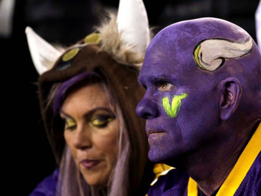
Well, after staring at this hue on the Pantone website for several minutes, you might be moved to describe this colour as a “dramatically provocative and thoughtful purple” with hints of blue — kind of a cross between a mature eggplant and a Minnesota Vikings jersey — but that is only because, when it comes to fashion, you are a complete idiot.
Here is what the geniuses at Pantone said in their news release about this year’s hue: “We are living in a time that requires inventiveness and imagination. It is this kind of creative inspiration that is indigenous to Ultra Violet, a blue-based purple that takes our awareness and potential to a higher level.
“From exploring new technologies and the greater galaxy, to artistic expression and spiritual reflection, intuitive Ultra Violet lights the way to what is yet to come. Complex and contemplative, Ultra Violet suggests the mysteries of the cosmos, the intrigue of what lies ahead and the discoveries beyond where we are now.”
They had a lot more to say about Ultra Violet, but the important thing to remember is (allow me to activate the caps lock feature on my keyboard) WE ARE TALKING ABOUT A (BAD WORD) COLOUR HERE!
Again, Mr. Doug Knows what you are thinking. You are thinking: “Gee, those nice Pantone colour experts must really enjoy recreational drugs, don’t they?”
Which is a terrible thing to say, because it could potentially lead to Pantone’s crackerjack lawyers crushing Mr. Doug like a grape, which would have the upside of closely resembling this year’s purplish colour of the year.
According to its news release, Pantone’s experts comb the world looking for new colour influences, including “the entertainment industry and films… popular travel destinations… and socio-economic conditions.”
In reality, Mr. Doug is pretty sure they just dump a large box of crayons on the floor, then release Frederico the Fashion Hamster, who eats the crayons and whatever colour he barfs up first — “BLAAARGH!” — becomes the colour of the year.
And if you don’t believe that, try holding your breath until your face turns Ultra Violet. You’ll know it’s the right shade when your face looks like your toes after you slam them into the furniture in the middle of the night because you were too lazy to turn on the light while trying to get to the bathroom.
doug.speirs@freepress.mb.ca