Sea reefs and sunsets: Living Coral is colour of the year
Advertisement
Read this article for free:
or
Already have an account? Log in here »
To continue reading, please subscribe:

Digital Subscription
One year of digital access for only $205*
- Enjoy unlimited reading on winnipegfreepress.com
- Read the E-Edition, our digital replica newspaper
- Access News Break, our award-winning app
- Play interactive puzzles
*First annual payment billed as $205.00 + GST for one year. This annual subscription will automatically renew at $233.00 + GST every 52 weeks (10% off the regular annual price of $259.35). Offer available to new and qualified returning subscribers only. Cancel any time.
To continue reading, please subscribe:
Add Free Press access to your Brandon Sun subscription for only an additional
$1 for the first 4 weeks*
- Enjoy unlimited reading on winnipegfreepress.com
- Read the E-Edition, our digital replica newspaper
- Access News Break, our award-winning app
- Play interactive puzzles
*Your next Brandon Sun subscription payment will increase by $1.00 and you will be charged $17.95 plus GST for four weeks. After four weeks, your payment will increase to $24.95 plus GST every four weeks.
Read unlimited articles for free today:
or
Already have an account? Log in here »
Hey there, time traveller!
This article was published 06/12/2018 (2853 days ago), so information in it may no longer be current.
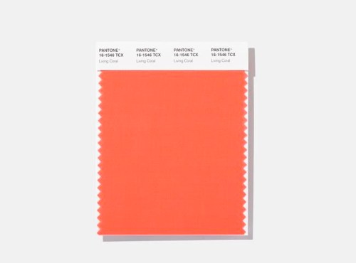
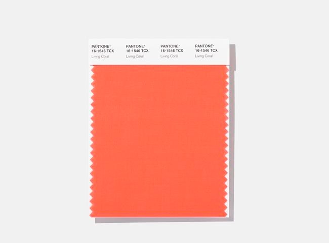
NEW YORK – It’s the colour of underwater reefs hanging on for dear life. The sky at dusk. Some of the latest iPhones and the latest looks on the runways of Marc Jacobs and other top fashion designers. Living Coral has been chosen by the Pantone Color Institute as its 2019 colour of the year.
Can a colour be convivial? Laurie Pressman, the company’s vice-president, considers this saturated orange base with a golden undertone not only warm and welcoming but versatile and life-affirming. It energizes with a softer edge than, say, its pastel and neon colour cousins.
“With everything that’s going on today, we’re looking for those humanizing qualities because we’re seeing online life dehumanizing a lot of things,” Pressman told The Associated Press ahead of Wednesday’s annual colour unveiling. “We’re looking toward those colours that bring nourishment and the comfort and familiarity that make us feel good. It’s not too heavy. We want to play. We want to be uplifted.”
But do we want to run toward this colour of grandmothers? Pressman also sees a retro vibe to Living Coral, in the same way a softer version of the 2018 pick, Ultra Violet, is the shade of some grey heads when hair toners bring on a turn to purple.
“It’s the emotional nourishment. It’s a big hug,” she said of Living Coral.
How important colour analysis is when weighed against, well, the rest of the world is in the eye of the beholder. Pantone is a for-profit enterprise that forecasts colour trends, analyzes the psychology of colour and advises companies on colour for product packaging and brand identity. Its wares come with price tags, but nearly 20 years of choosing colours of the year has been a useful marketing strategy and free, free, free.
Living Coral is ascending, Pressman said, at a time when bleaching due to climate change continues to rob actual coral reefs of their rainbows. It’s a colour that seems to work for everybody, across the gender spectrum in apparel and across segments, from art and housewares to home interiors and industrial design.
The colour also points to a long and often painful slog over the last decade or so through financial market scares and political crises to environmental chaos and the rise of social media, where saturated colour presides, Pressman said.
“We’re seeing so much more saturated colour,” she said. “That’s the influence of social media because people want things to stand out. This is definitely a colour you see on social media.”

Living Coral is vivifying, but it’s “not so overpowering and in your face,” she said. “It’s bright enough, and engaging.”
Officially, Living Coral is Pantone 16-1546. Ever wonder what those Pantone numbers are all about? Well, they’re broken into three pairs and refer to a colour’s level of lightness, hue and “chroma,” on various scales. What, you ask, is chroma? It’s a description that combines hue and saturation. A set of letters after the numbers indicate the material or substance upon which the colour was printed or otherwise placed, such as dyed cotton or paper.
Coming up with such colour standards is one of those other things Pantone does when it’s not announcing colours of the year.
Before Ultra Violet was chosen for 2018, there was Greenery the year before. In 2016, Pantone picked a duo for the first time: Serenity (a baby blue) and Rose Quartz (a light pink).
The selection process spans the year. Pantone’s experts travel the world in search of colour influences that gained momentum, from the entertainment industry and travelling art collections to fashion and beauty trends, travel destinations and specialty shows for design and decor.